iOS UIKit 组件详解:UIScrollView、UILabel、UIImage、UIButton 与手势识别
December 19, 2024 (1y ago)
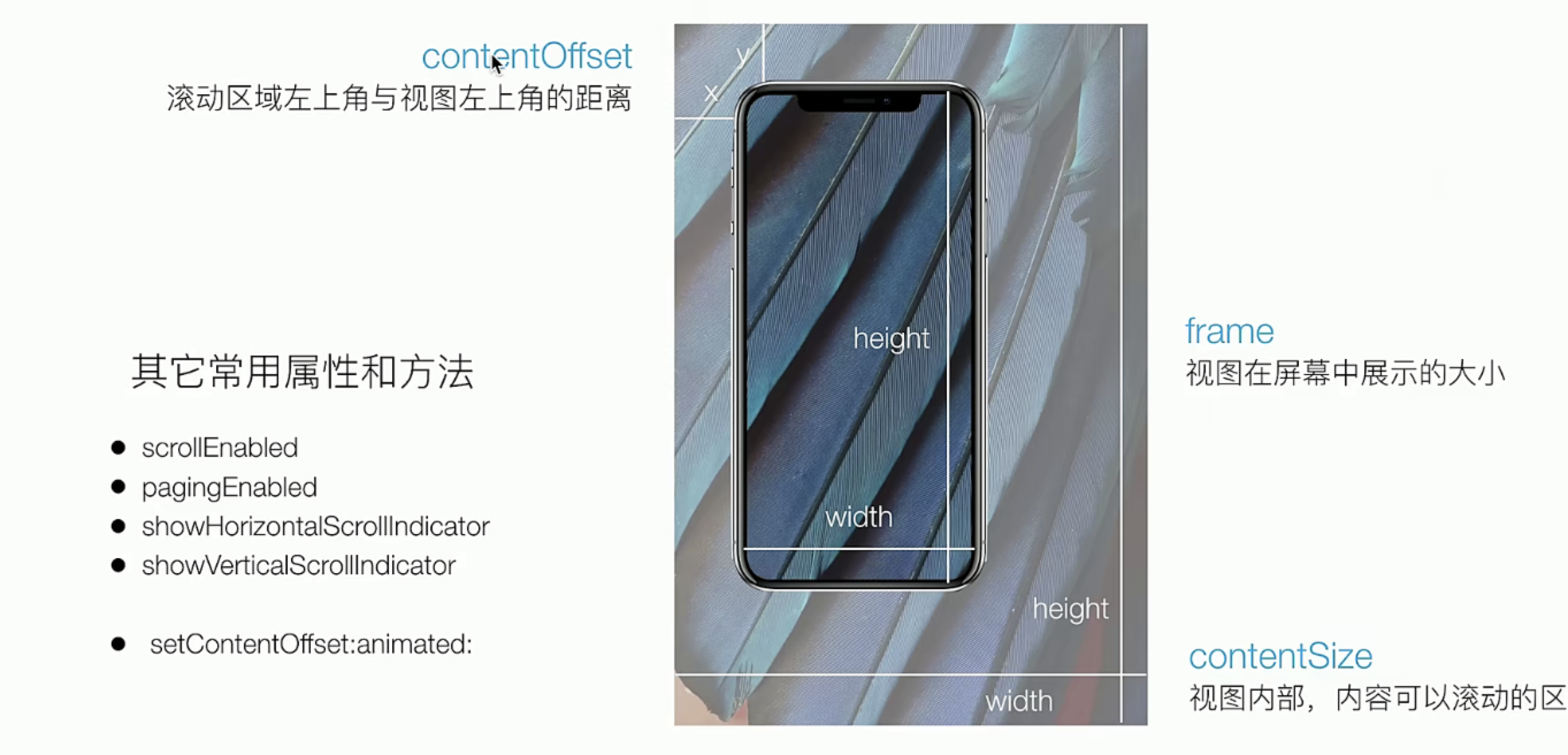
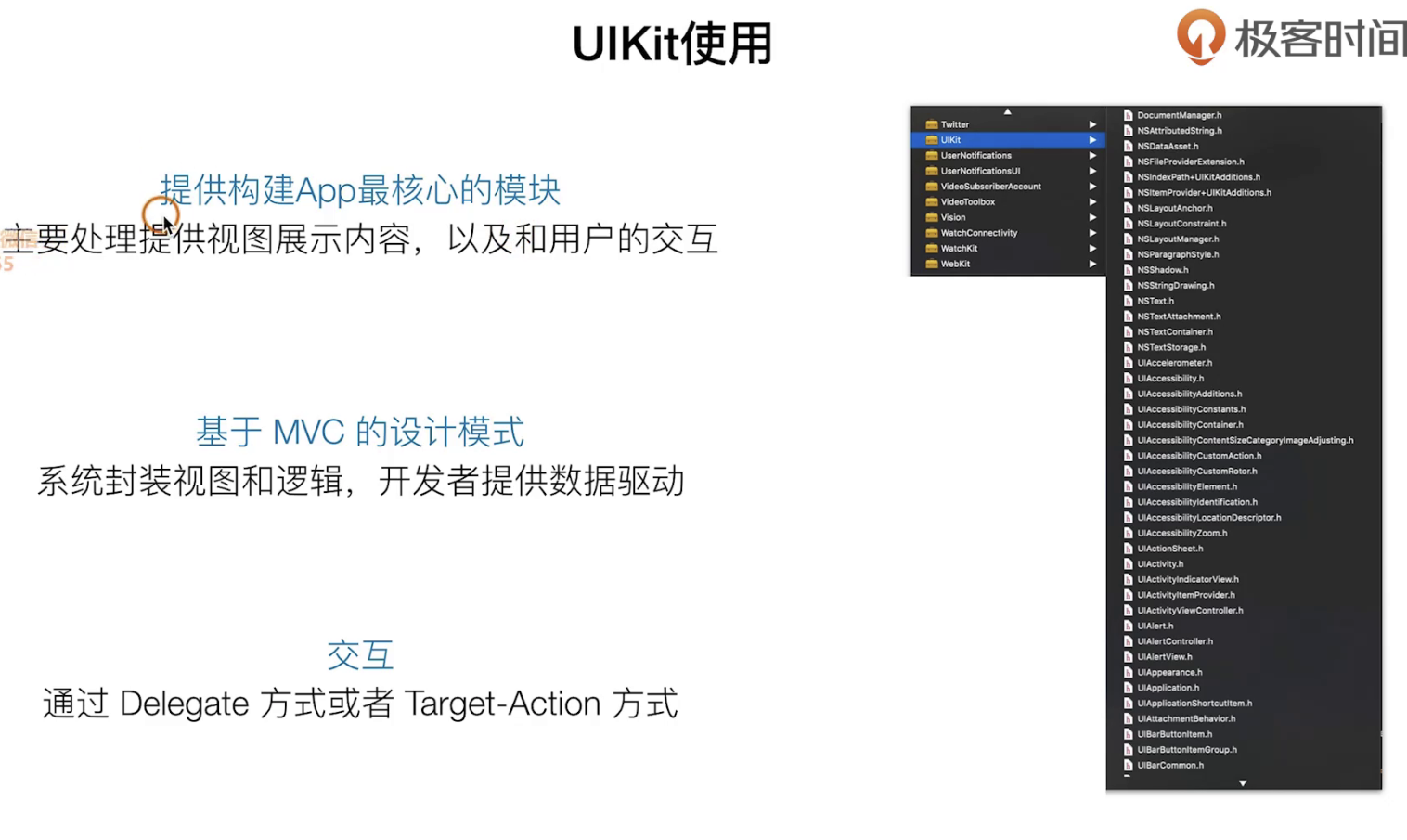
UIScrollerView
UIView是最基础的展示,UITabVIew 和UICollectionVIew 都是继承UIScrlloVIew逻辑,所以我们来看看它
创建一个
理论知识
通过本次课的学习我们要求掌握如下的技能:创建横向滚动,创建一个滚动条效果(涉及到的点:循环,数组)
实践指南
我们有下面的几个步骤要做,
- 把tabBarItem3 独立出来,
- 创建一个基础的UIScrollVIew
- 实现一个翻页效果
//  CGZxViewController.m
//  SimpelApp
//
//  Created by 李仕增 on 2021/10/23.
//

#import "CGZxViewController.h"

@interface CGZxViewController ()

@end

@implementation CGZxViewController


- (instancetype) init {
    self = [super init];
    if (self) {
        self.view.backgroundColor = [UIColor orangeColor];
        self.tabBarItem.title =@"资讯";
        self.tabBarItem.image = [UIImage imageNamed:@"icon.bundle/video.png"];
        self.tabBarItem.selectedImage = [UIImage imageNamed:@"icon.bundle/videoActive.png"];
    }
    return  self;
};


- (void)viewDidLoad {
    [super viewDidLoad];
    self.view.backgroundColor = [UIColor whiteColor];

    UIScrollView *scrollerView = [[UIScrollView alloc] initWithFrame:self.view.bounds];
    scrollerView.backgroundColor = [UIColor lightGrayColor];
    // 设置中心点让他 路由滚动
    scrollerView.contentSize = CGSizeMake(self.view.bounds.size.width * 5, self.view.bounds.size.height);

    // 循环创建view 添加到ScrollView中去
    NSArray *colorArray = @[[UIColor redColor], [UIColor systemPinkColor], [UIColor yellowColor], [UIColor greenColor], [UIColor grayColor]];

    for (int i = 0; i < 5; i++) {
        [scrollerView addSubview:({
            UIView *view = [ [UIView alloc] initWithFrame:CGRectMake(scrollerView.bounds.size.width, 0, scrollerView.bounds.size.width, scrollerView.bounds.size.height) ];
            view.backgroundColor = [colorArray objectAtIndex:i];
            view;
        })];
    }

    // 父容器开启滚动特效
    scrollerView.pagingEnabled =YES;
    [self.view addSubview:scrollerView];


}

@end
我们看看一些骚操作
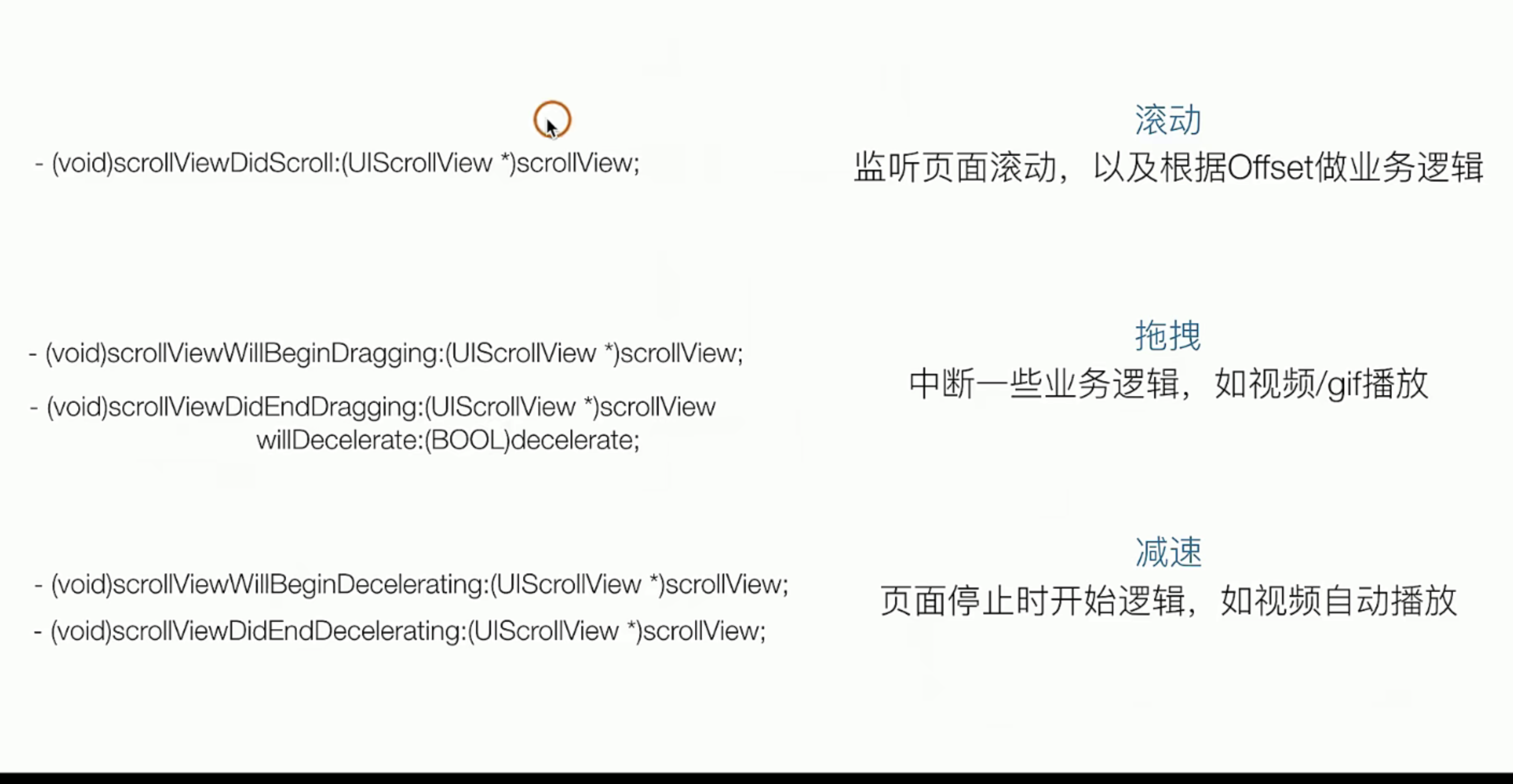
和其他的delegate模式一样,我们也是这样的用以下是UIScollerVIew上的一些delegate
@interface CGZxViewController ()<UIScrollViewDelegate>

//+++++
- (void)viewDidLoad {
    [super viewDidLoad];
    self.view.backgroundColor = [UIColor whiteColor];

    UIScrollView *scrollerView = [[UIScrollView alloc] initWithFrame:self.view.bounds];
    scrollerView.backgroundColor = [UIColor lightGrayColor];
    // 设置中心点让他 路由滚动
    scrollerView.contentSize = CGSizeMake(self.view.bounds.size.width * 5, self.view.bounds.size.height);
    scrollerView.delegate = self;

//+++++
- (void)scrollViewDidScroll:(UIScrollView *)scrollView {
    NSLog(@"scroll start ....");
};

- (void)scrollViewWillBeginDecelerating:(UIScrollView *)scrollView {
    NSLog(@"scroll end ....");
};

- (void)scrollViewDidEndDecelerating:(UIScrollView *)scrollView {
    NSLog(@"Drag start ....");
};

- (void)scrollViewDidEndScrollingAnimation:(UIScrollView *)scrollView {
    NSLog(@"Drag edn ....");
};
总结归纳一下目前学习到的视图
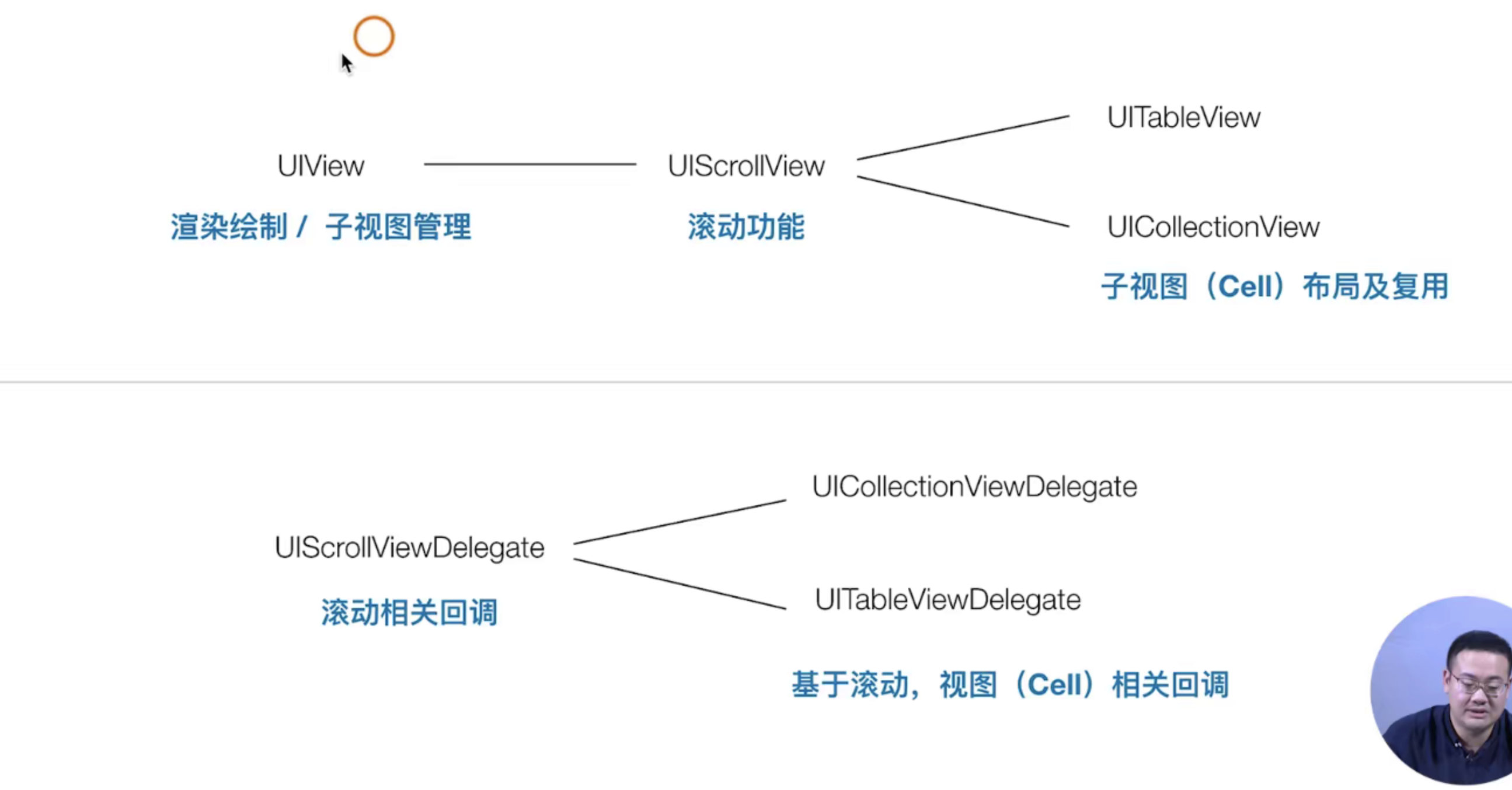 从继承的类图上来看,我们可以猜测一下,子的UITabViewDelegate能否响应 父类的 UIScllorDelegate呢?答案是可以的,这样的操作相当于重写
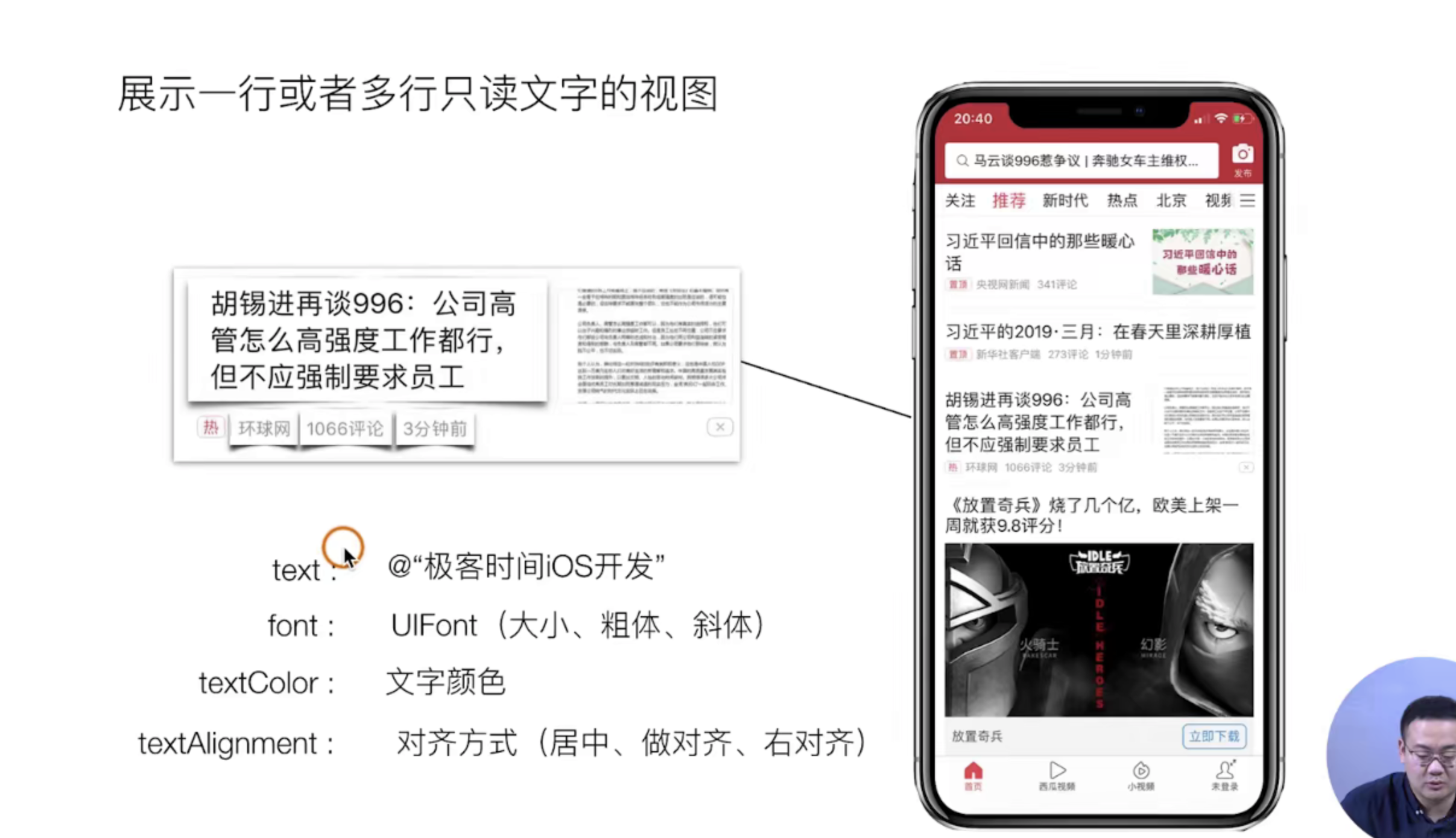
UILabel
理论知识
实战指南
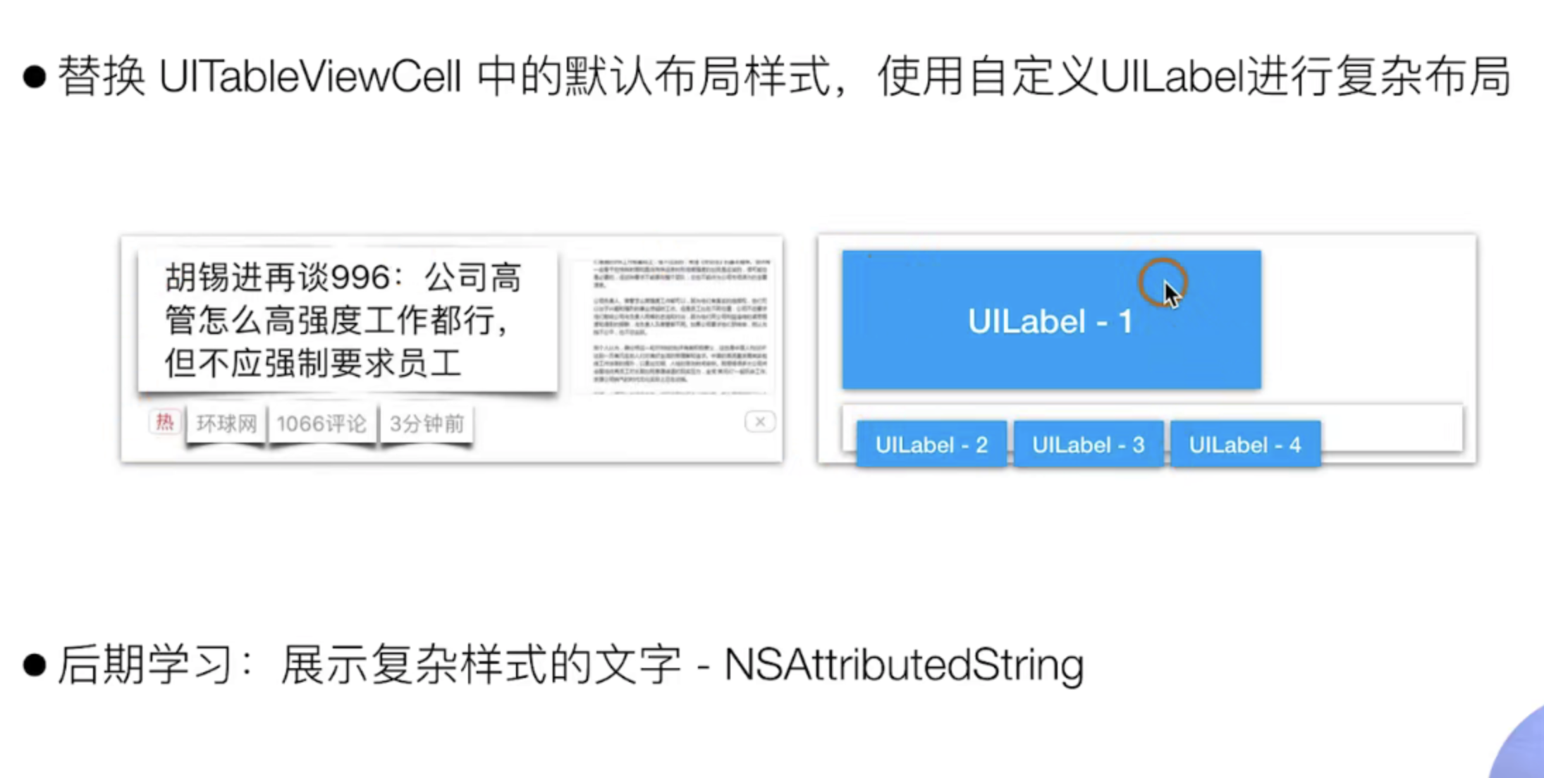
这节课我们主要的目的是实现上诉的UIlabel-1 这个蓝色的图片的效果,主要的实现有下面的几个步骤
- [x]  把原来的首页的UITabViewCell迁移出去独立成文件(注意不要选错了集成的类哈你要选的是cell而不是其他)
- [x]  自定义实现一个类 ,定义我们的私有@peorty属性 用于承载我们需要的四个文字Lablea
- [x]  细微的调整整个布局和样式
// 1. 新建的文件完成迁移工作
// 首页viewController.m
- (UITableViewCell *)tableView:(UITableView *)tableView cellForRowAtIndexPath:(NSIndexPath *)indexPath {
CGPtTableViewCell *cell = [tableView dequeueReusableCellWithIdentifier:@"id"];
if ( !cell ) {
cell = [[CGPtTableViewCell alloc] initWithStyle:UITableViewCellStyleSubtitle reuseIdentifier:@"id"];
}
// cell.textLabel.text = [NSString stringWithFormat:@"主标题 - %@",@(indexPath.row)];
// cell.detailTextLabel.text = @"副标题";
// cell.imageView.image = [UIImage imageNamed:@"icon.bundle/video.png"];
return cell;
};
// 2. 定义属性Lable 和重写 cell默认的Lable
//
// CGPtTableViewCell.m
#import "CGPtTableViewCell.h"
@interface CGPtTableViewCell ()
@property(nonatomic, strong, readwrite) UILabel *titleLabel;
@property(nonatomic, strong, readwrite) UILabel *sourceLabel;
@property(nonatomic, strong, readwrite) UILabel *commentLabel;
@property(nonatomic, strong, readwrite) UILabel *timeLabel;
@end
@implementation CGPtTableViewCell
- (instancetype) initWithStyle:(UITableViewCellStyle)style reuseIdentifier:(nullable NSString *)reuseIdentifier {
self=[super initWithStyle:style reuseIdentifier:reuseIdentifier];
if(self){
// 创建自己的cell
[self.contentView addSubview:({
self.titleLabel = [[UILabel alloc] initWithFrame:CGRectMake(20, 15, 300, 50)];
self.titleLabel.backgroundColor = [UIColor redColor];
self.titleLabel.font = [UIFont systemFontOfSize:16];
self.titleLabel.textColor = [UIColor blackColor];
self.titleLabel;
})];
[self.contentView addSubview:({
self.sourceLabel = [[UILabel alloc] initWithFrame:CGRectMake(20, 80, 50, 20)];
self.sourceLabel.backgroundColor = [UIColor redColor];
self.sourceLabel.font = [UIFont systemFontOfSize:12];
self.sourceLabel.textColor = [UIColor grayColor];
self.sourceLabel;
})];
[self.contentView addSubview:({
self.commentLabel = [[UILabel alloc] initWithFrame:CGRectMake(100, 80, 50, 20)];
self.commentLabel.backgroundColor = [UIColor redColor];
self.commentLabel.font = [UIFont systemFontOfSize:12];
self.commentLabel.textColor = [UIColor grayColor];
self.commentLabel;
})];
[self.contentView addSubview:({
self.timeLabel = [[UILabel alloc] initWithFrame:CGRectMake(160, 80, 50, 20)];
self.timeLabel.backgroundColor = [UIColor redColor];
self.timeLabel.font = [UIFont systemFontOfSize:12];
self.timeLabel.textColor = [UIColor grayColor];
self.timeLabel;
})];
}
return self;
}
@end
// 3. 设置一个方法给外部调用 每次布局的时候会自动去掉初始化它
- (void) layoutInitCell {
self.titleLabel.text = @"老李的博客";
self.sourceLabel.text = @"老李的博客";
self.commentLabel.text = @"老李的博客";
self.timeLabel.text = @"老李的博客";
}
// 不要忘记去暴露出去
@interface CGPtTableViewCell : UITableViewCell
- (void) layoutInitCell
@end
// 外部调用的时候
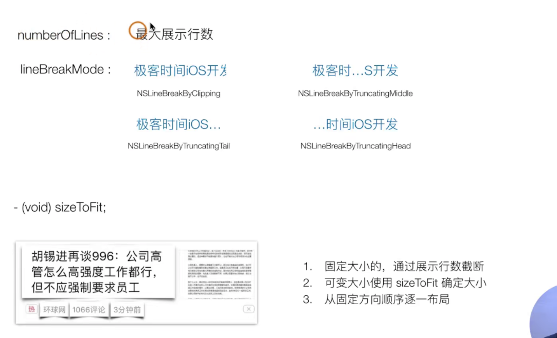
// 4. 开始细微的调整样式 我们之前理论学习的时候有详细的说国 Label的自适应规则 可以自己回顾一下 看看
- (void) layoutInitCell {
self.titleLabel.text = @"老李发表的一片博客老李发表的一片博客老李发表的一片博客老李发表的一片博客老李发表的一片博客";
self.sourceLabel.text = @"极客时间极";
self.commentLabel.text = @"1988条评论";
[self.commentLabel sizeToFit];
self.commentLabel.frame = CGRectMake(self.sourceLabel.frame.origin.x + self.sourceLabel.frame.size.width + 15, self.commentLabel.frame.origin.y , self.commentLabel.frame.size.width,self.commentLabel.frame.size.height);
self.timeLabel.text = @"三分钟前";
[self.timeLabel sizeToFit];
self.timeLabel.frame = CGRectMake(self.commentLabel.frame.origin.x + self.commentLabel.frame.size.width + 15, self.timeLabel.frame.origin.y , self.timeLabel.frame.size.width,self.timeLabel.frame.size.height);
}
UIImage
理论知识
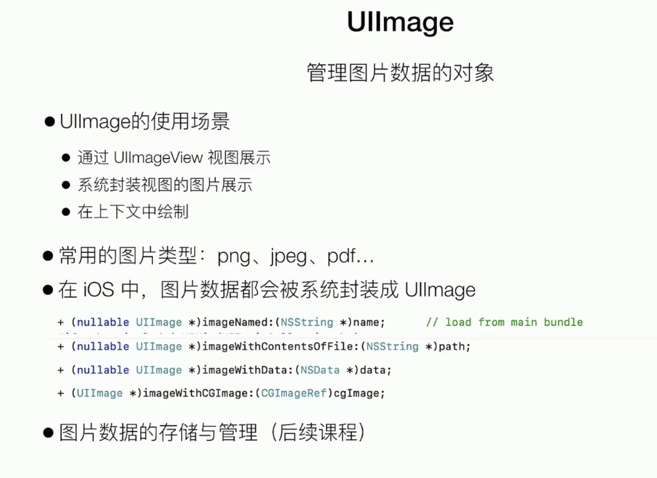
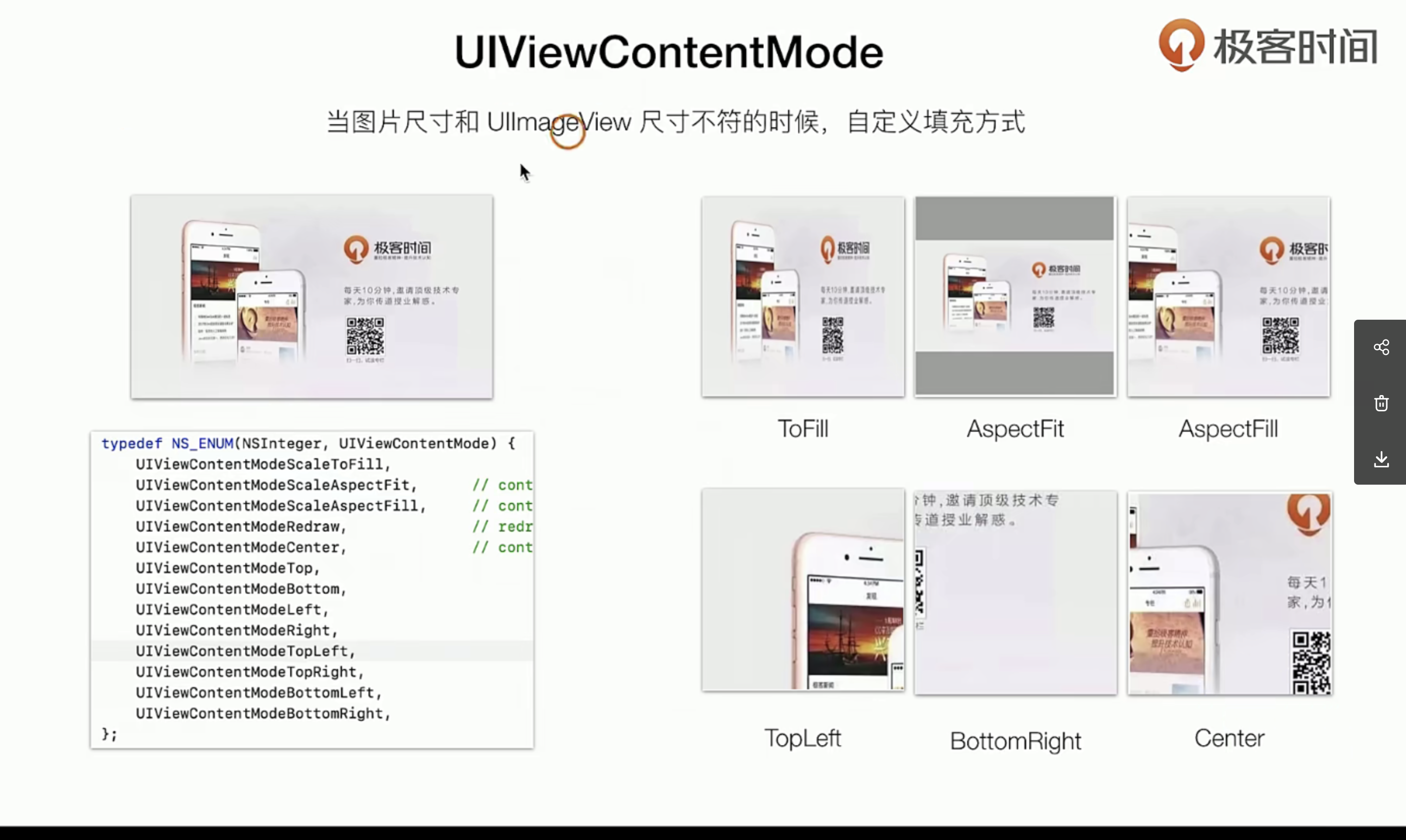
实战指南
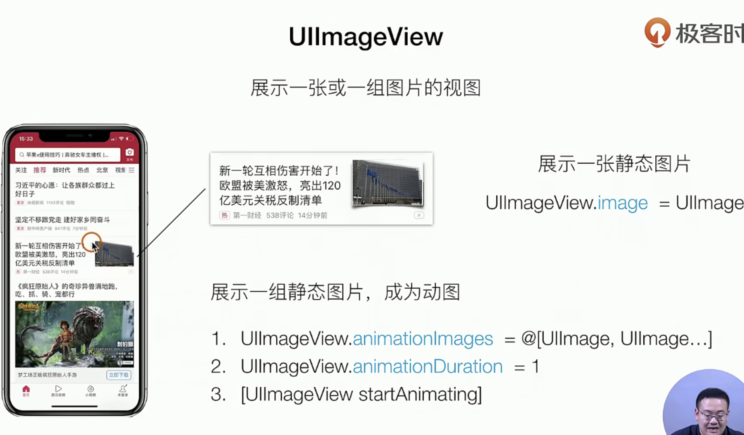
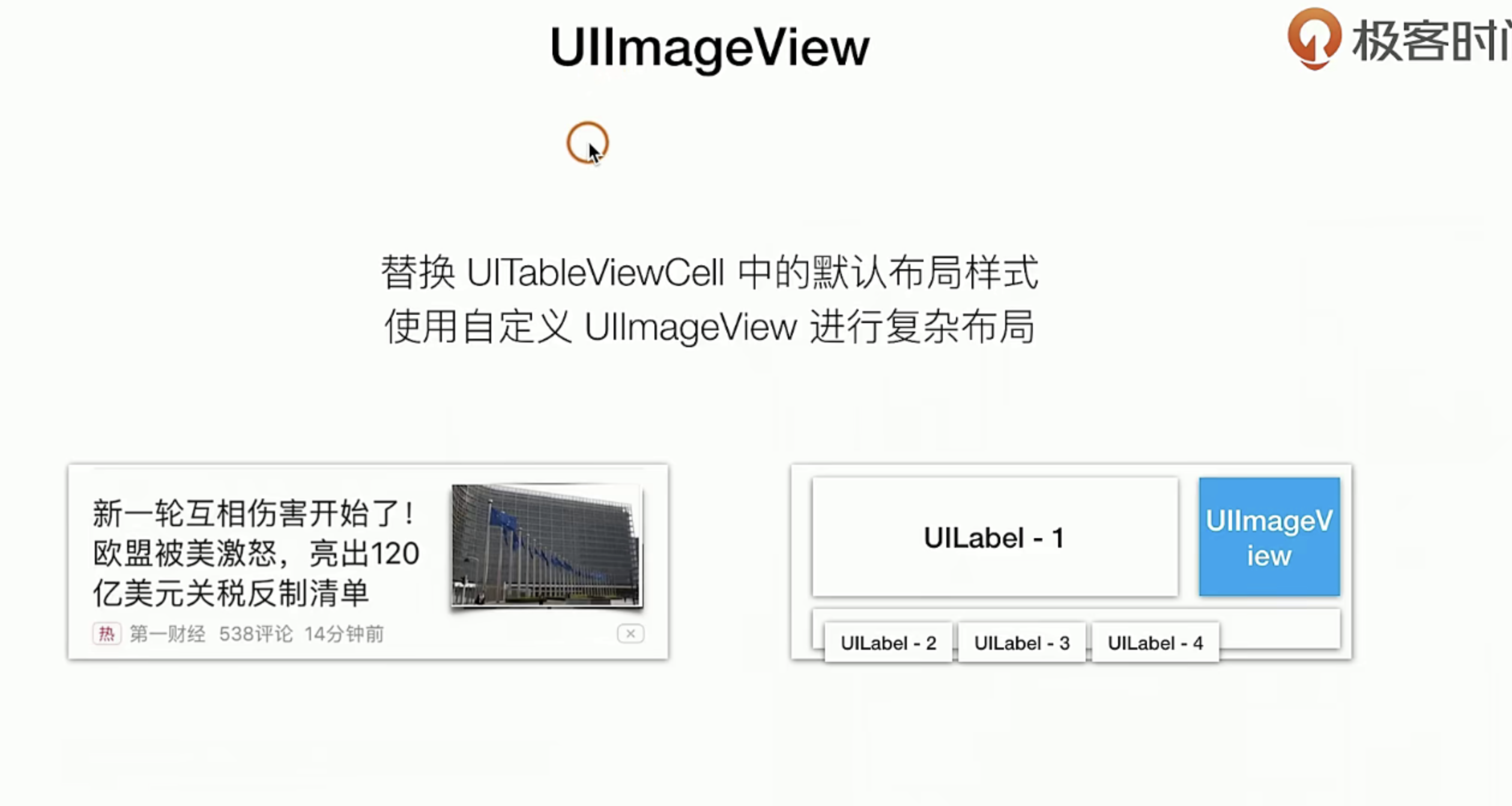
我们需要加入一个UIImageView,实际上这也非常的简单 只需要在我们上一节的基础上添加一个UIVIew就行了,说白了UIImgView 也是一种UIVIew只不过它是拿来承载 Img的而已
#import "CGPtTableViewCell.h"

@interface CGPtTableViewCell ()

@property(nonatomic, strong, readwrite) UIImageView *rightImageView;

@end

@implementation CGPtTableViewCell

- (instancetype) initWithStyle:(UITableViewCellStyle)style reuseIdentifier:(nullable NSString *)reuseIdentifier {

    self=[super initWithStyle:style reuseIdentifier:reuseIdentifier];

    if(self){
      +++++
//        这里我们来加一个UIImageVIew
        [self.contentView addSubview:({
            self.rightImageView = [[UIImageView alloc] initWithFrame:CGRectMake(260, 25, 100, 60)];
            self.rightImageView.backgroundColor = [UIColor redColor];
//          先给一个图片的自适应模式
            self.rightImageView.contentMode =UIViewContentModeScaleAspectFit;
            self.rightImageView;
        })];


    }
    return  self;
}

- (void) layoutInitCell {
	+++++

    //  这个会返回一个UIImage类
    self.rightImageView.image = [UIImage imageNamed:@"icon.bundle/home.png"];
}

@end
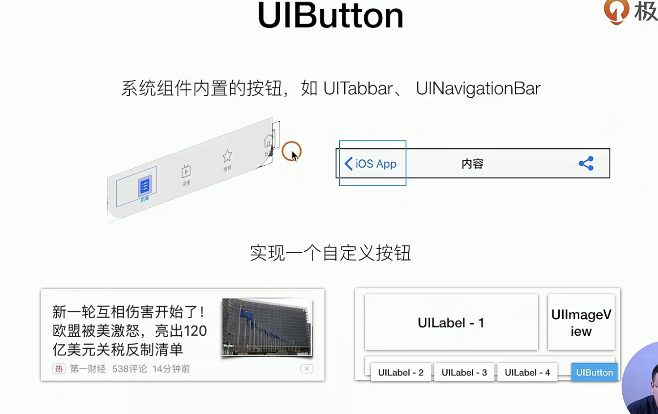
按钮、点击、手势识别UIButton
从展示的角度看UIButton
理论知识
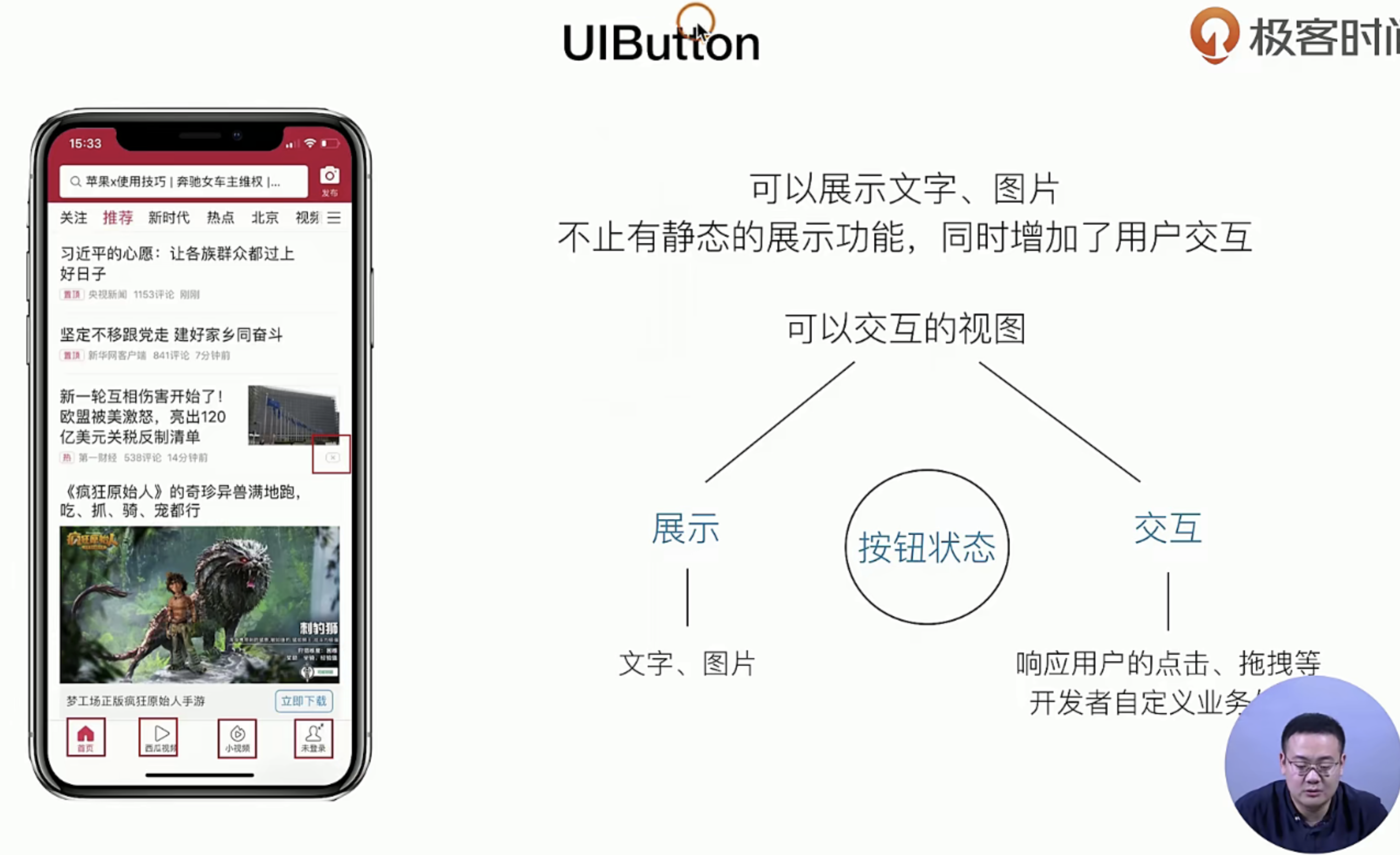
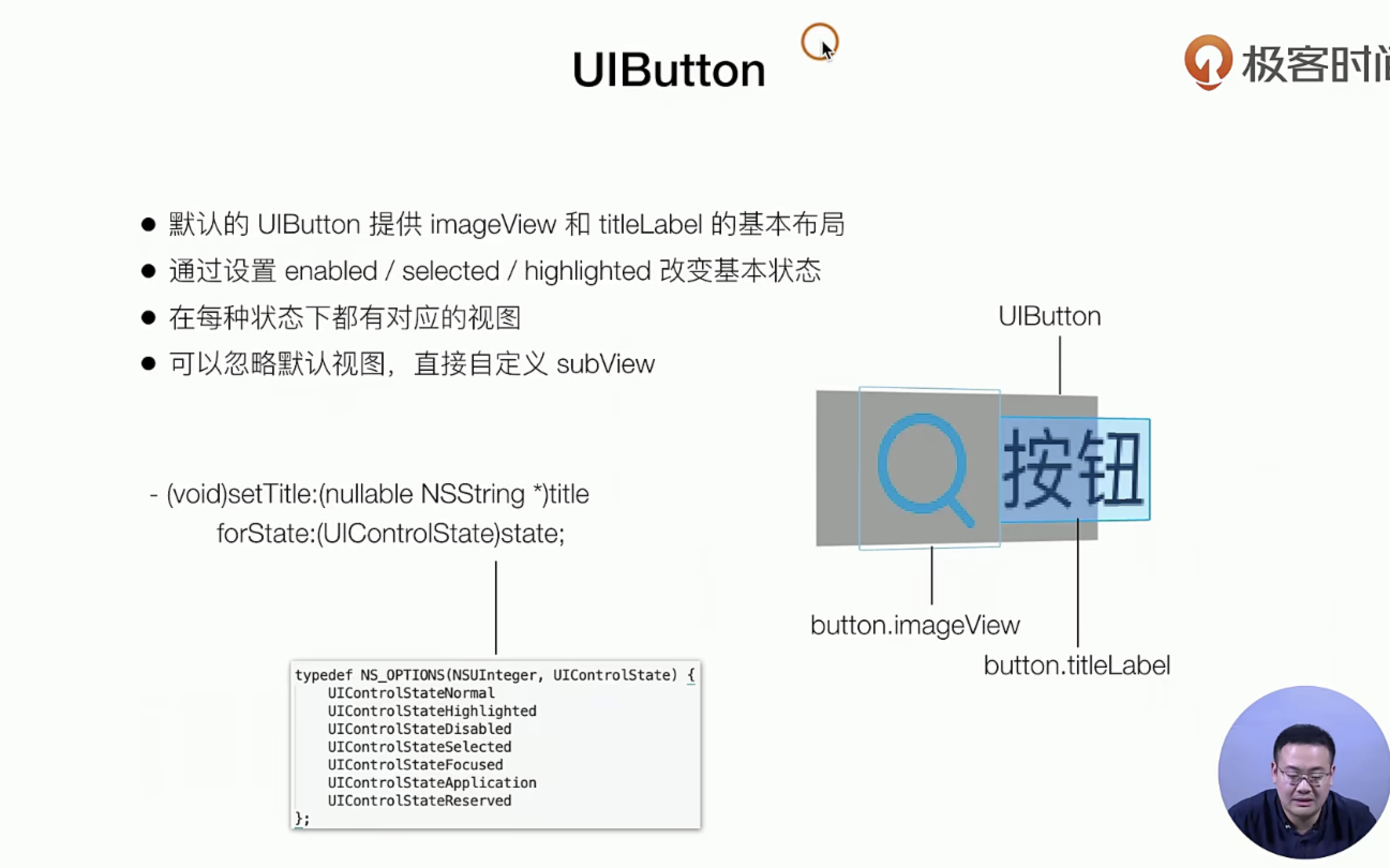
对于UIButton来说有两个部分 一个展示 和交互,我们可以先来看看 UIButton的展示
上面我们讲解了UIButton的展示,我们可以再看看作为交互的时候
代码实战
我们的目标是基于原来的项目 Item 加一个Button
 ++++
     //        这里我们来加一个UIButton
     [self.contentView addSubview:({
         self.myButton = [[UIButton alloc] initWithFrame:CGRectMake(260, 35, 30, 30)];
         [self.myButton setTitle:@"X" forState:UIControlStateNormal];  // 普通点击的时候
         [self.myButton setTitle:@"V" forState:UIControlStateHighlighted];
         // 点击选中的时候

         self.myButton.backgroundColor = [UIColor systemBlueColor];
         self.myButton;
     })];
从交互角度看UIButton
理论知识
我们看看这里有个另一个 设计模式:Target-action(类似于JS中的事件监听缺点就是不好传值)
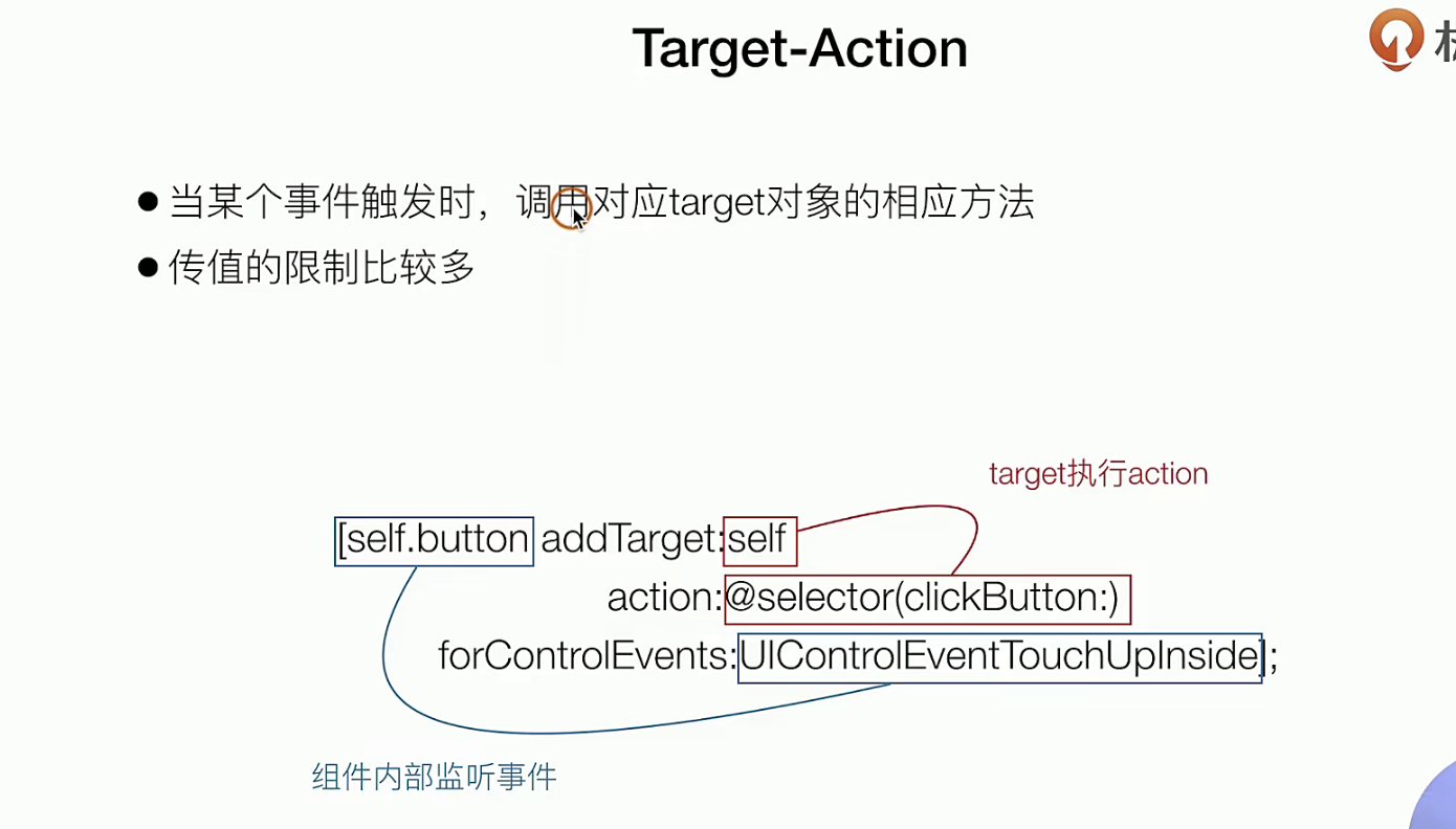
如果是换做React来说就像Props传递 方法,下面的事件都是UIkit提供的系统级的事件
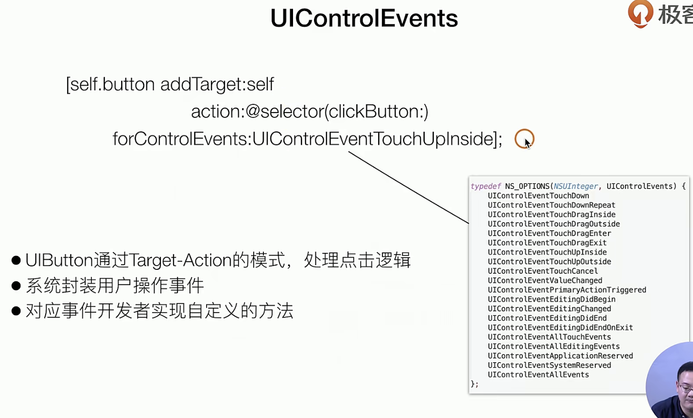
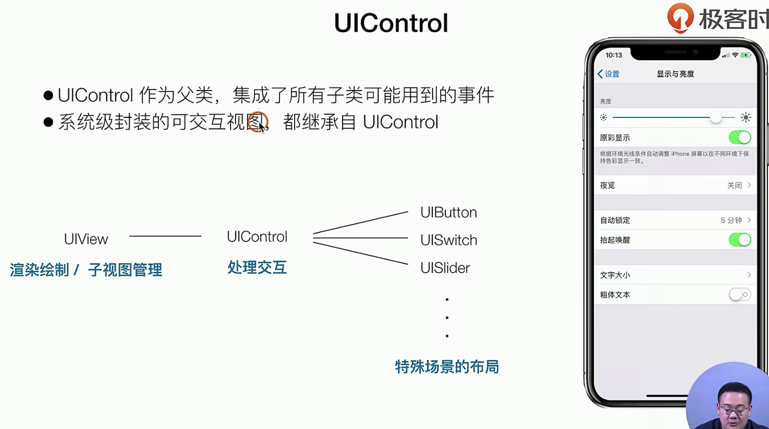
在交互层面主要是UIContorl这个父类
实战指南
//        这里我们来加一个UIButton
        [self.contentView addSubview:({
            self.myButton = [[UIButton alloc] initWithFrame:CGRectMake(260, 35, 30, 30)];
            [self.myButton setTitle:@"X" forState:UIControlStateNormal];
            [self.myButton setTitle:@"V" forState:UIControlStateHighlighted];
            self.myButton.backgroundColor = [UIColor systemBlueColor];
//            添加一个事件
            [self.myButton addTarget:self action:@selector(myButtonClick) forControlEvents:UIControlEventTouchUpInside];
            self.myButton;
        })];
++++

- (void) myButtonClick {
    NSLog(@"点击我了");
}
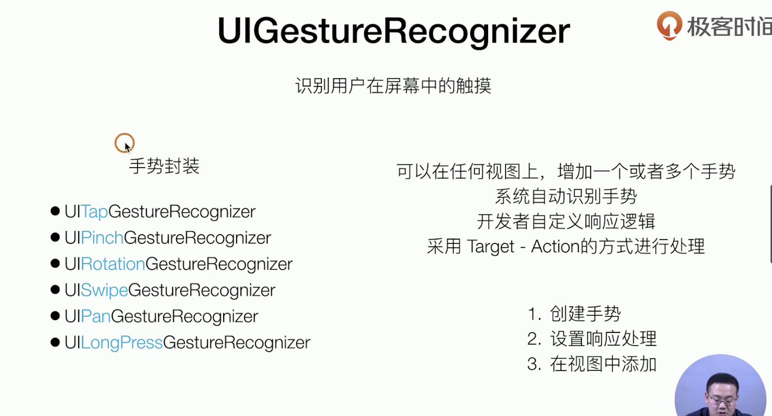
识别手势 UIGestureRecongnizer
理论知识
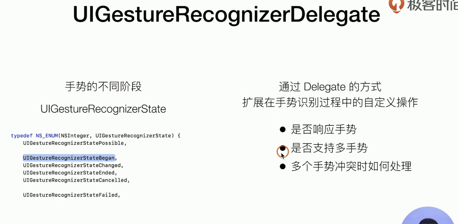 Delegate模式又来了 你需要搞搞看看Delegate哈,复习复习
实战指南
我们主要是先搞了一个手势识别功能,然后使用Delegate设计模式,实现几个协议
+++++
//
//  MimeViewController.m
//  SimpelApp
//
//  Created by 李仕增 on 2021/11/2.
//

#import "MimeViewController.h"

@interface MimeViewController ()<UIGestureRecognizerDelegate>

@end

@implementation MimeViewController

- (instancetype) init {
    self = [super init];
    if(self) {
        self.view.backgroundColor = [UIColor orangeColor];
        self.tabBarItem.title =@"我的";
        self.tabBarItem.image = [UIImage imageNamed:@"icon.bundle/Customer.png"];
        self.tabBarItem.selectedImage = [UIImage imageNamed:@"icon.bundle/CustomerActive.png"];
    }
    return  self;
};

- (void)viewDidLoad {
    [super viewDidLoad];
    self.view.backgroundColor = [UIColor whiteColor];

    UIView *view = [[UIView alloc] initWithFrame:CGRectMake(100, 200, 100, 100)];
    view.backgroundColor = [UIColor systemPinkColor];
//    设置手势
    UITapGestureRecognizer *tapGesture = [[UITapGestureRecognizer alloc] initWithTarget:self action:@selector(viewClck)];

//    绑定手势
    [view addGestureRecognizer:tapGesture];

//    实现Delegate协议 自定义的控制 手势的各项参数
    tapGesture.delegate = self;

    [self.view addSubview:view];
}

- (void) viewClck {
    NSLog(@"888");
}

- (BOOL)gestureRecognizerShouldBegin:(UIGestureRecognizer *)gestureRecognizer {
    return  NO; // 放回fals就是书不需要这个手势的
};

@end
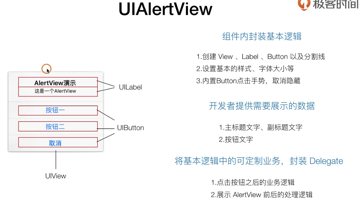
展示一个弹窗(最后一个UIkit组件)选学哈
这个东西 已经被 官方废弃了哈,但是封装比较好,我们需要学习:”如何应对一个负责组件的设计从0到1“
理论知识
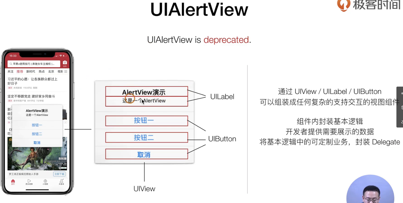
这个封装主要需求是如下:
- 需要浮层展示
- 需要用户传递参数
- 需要事件和传参
设计模式如下
走挖源码去
**<font style="color:#FA541C;">总结散花,以上就是师傅领进门,UIKit完全解读</font>**